
FR Forms/en: verschil tussen versies
Nieuwe pagina aangemaakt met 'FR Forms' |
Bijgewerkt vanwege een nieuwe basisversie van de bronpagina |
||
| Regel 1: | Regel 1: | ||
<languages /> | <languages /> | ||
FR Forms is a module that allows you to create various (contact) forms. | |||
FR Forms is | |||
Each form has its own settings: | |||
* Fields: Create various types of data fields as needed | |||
* | * Layout: For the “front end” of your website | ||
* | * Messages: Create automatically generated notifications and emails as needed | ||
* | * Success: Choose between a custom page or a simple notification (text) | ||
* | |||
As an additional option, you can use CAPTCHA to protect against spam. | |||
== Fields == | |||
[[File:Fields.png|left|117x117px|Fields]] | |||
[[File: | Click the ''Add Field'' button to add new fields | ||
<br clear="all"> | <br clear="all"> | ||
Depending on the field type, several properties are displayed: | |||
[[File:Fields-add.png|left|397x397px|Add fields]] | |||
[[File: | '''Type:''' Select the desired type; see (A) | ||
'''Type:''' | |||
'''Label:''' Enter a label for this field | |||
'''Label:''' | |||
'''Placeholder key:''' This is automatically filled in when a new field is created | |||
'''Placeholder | |||
'''Status:''' Is the field mandatory, optional, or something else? See (B) | |||
'''Status:''' | |||
'''Default value:''' optional | |||
''' | |||
'''Placeholder text:''' optional, to help visitors enter information | |||
''' | |||
'''Help text:''' optional; displays a help message for visitors | |||
''' | |||
'''Maximum length:''' optional; use this to limit input | |||
''' | |||
'''Layout selection button:''' optional; set the page view; see (C) | |||
''' | |||
<br clear="all"> | <br clear="all"> | ||
=== Example of a created field === | |||
[[File:Fields-example.png|left|345x345px|example]] | |||
[[File: | |||
<br clear="all"> | <br clear="all"> | ||
=== Order - as displayed on the web page === | |||
[[File:Fields-order.png|alt=field order]] | |||
[[File: | |||
<br clear="all"> | <br clear="all"> | ||
The web page displays the created fields in the order they appear in the page section. You can change this order using the '''up''' and '''down''' buttons. | |||
<gallery widths=250> | <gallery widths=250> | ||
File: | File:Fields-type.png|alt=veldtypen|149x149px|'''A - field types''' | ||
File: | File:Fields-status.png|alt=veldstatussen|168x168px|'''B - field status''' | ||
File: | File:Fields-layout.png|alt=veld pagina weergave|353x160px|'''C - field layout''' | ||
</gallery> | </gallery> | ||
== Layout == | |||
''Layout'' lets you set the formatting as it will appear on the web page. | |||
[[File:Layout.png|left|421x421px|layout]] | |||
'''Form Style:''' Choose the alignment of the input field labels: on the same line or with the label above the input field | |||
''' Field theme:''' Select a predefined style from the table; see (A) | |||
'''Grid spacing:''' Select the desired distance between the label and an input field | |||
'''Visual layout editor:''' Specify the grid in which the fields are displayed; see (B) | |||
'''Submit button text:''' Enter the text to be displayed on the submit button | |||
''' Submit button alignment:''' Specify the alignment for the text on the submit button | |||
<br clear="all"> | |||
<div class="mw-translate-fuzzy"> | |||
=== '''A - Field Theme''' === | |||
[[File:Layout-theme.png|left|Layout theme]] | |||
<nowiki> </nowiki>Each theme has its own settings, or none: '''No styling''' | |||
</div> | </div> | ||
< | Try them out, and choose the theme that best suits your website. | ||
== | |||
See (C) for examples by theme. | |||
[[File: | <br clear="all"> | ||
''' | |||
</ | === '''B - Visual Layout Editor''' === | ||
[[File:'Layout-editor.png|left|492x492px|Visual Layout Editor]] | |||
You can arrange the fields in 1, 2, or 3 columns. See the example. | |||
You can also spread the fields across multiple rows. | |||
Move the columns by dragging them or using the position selection buttons. | |||
You can set the rows using the position selection buttons. | |||
<br clear="all"> | |||
<span id="C_-_voorbeelden_veldthema's"></span> | |||
=== '''C - examples of field themes''' === | |||
<span id="thema:_Geen_stylingalt=geen_stijling"></span> | |||
===== Theme: ''No Styling''[[File:Layout-nostyling.png|alt=Layout no styling]] ===== | |||
<span id="thema:_Nice_formalt=nice_form"></span> | |||
==== Theme: ''Nice form''[[File:layout-niceform.png|alt= Layout nice form]] ==== | |||
<span id="thema:_Bootstrapalt=bootstrap"></span> | |||
==== Theme: ''Bootstrap''[[File:Layout-bootstrap.png|alt=Layout bootstrap]] ==== | |||
<span id="thema:_Material_UI_(filled)alt=material_UI_filled"></span> | |||
==== Theme: ''Material UI (filled)''[[File:Layout-uifilled.png|alt=Layout material UI filled]] ==== | |||
< | <span id="thema:_Material_UI_(outlined)alt=material_UI_outlined"></span> | ||
==== Theme: “Material UI (outlined)”[[File:Layout-uioutlined.png|alt=Layout material UI outlined]] ==== | |||
< | <span id="thema:_Material_UI_(standard)alt=material_UI_standard"></span> | ||
==== Theme: “Material UI (standard)”[[File:Layout-uistandard.png|alt=Layout material UI standard]] ==== | |||
</ | |||
<div lang="nl" dir="ltr" class="mw-content-ltr"> | <div lang="nl" dir="ltr" class="mw-content-ltr"> | ||
''' | == Berichten == | ||
Met ''Berichten'' stel je opmaak vast zoals die op de webpagina wordt getoond. | |||
[[Bestand:Berichten.png|links|417x417px]] | |||
'''E-mailconfiguratie:''' de module controleert de e-mailconfiguratie. Deze stel je in WB in, menu Instellingen, onderdeel Mailerinstellingen. | |||
</div> | </div> | ||
<div lang="nl" dir="ltr" class="mw-content-ltr"> | <div lang="nl" dir="ltr" class="mw-content-ltr"> | ||
''' | '''E-mailtemplates:''' stel je eigen templates samen, als automatisch antwoord naar een inzender en of naar de e-mailafhandelaar. Zie (A), onder (B) vind je een voorbeeld | ||
</div> | </div> | ||
<div lang="nl" dir="ltr" class="mw-content-ltr"> | <div lang="nl" dir="ltr" class="mw-content-ltr"> | ||
''' | '''Formulierinzendingen:''' indien je deze laat opslaan kan je ze bekijken. Denk er aan dat gegevens vastleggen onder de AVG valt. Zie (C) | ||
<br clear="all"> | <br clear="all"> | ||
</div> | </div> | ||
<div lang="nl" dir="ltr" class="mw-content-ltr"> | <div lang="nl" dir="ltr" class="mw-content-ltr"> | ||
=== | === A - e-mailtemplates === | ||
[[ | [[Bestand:Berichten antwoord.png|links|391x391px|Berichten antwoord]] | ||
'''Naam:''' bedenk een korte, duidelijke naam | |||
</div> | </div> | ||
<div lang="nl" dir="ltr" class="mw-content-ltr"> | <div lang="nl" dir="ltr" class="mw-content-ltr"> | ||
'''Aan:''' inzender > gebruik de placeholder, bv [e-mailadres], afhandelaar > type het mailadres in | |||
</div> | </div> | ||
<div lang="nl" dir="ltr" class="mw-content-ltr"> | <div lang="nl" dir="ltr" class="mw-content-ltr"> | ||
'''Van (e-mailadres):''' type een e-mailadres in | |||
</div> | </div> | ||
<div lang="nl" dir="ltr" class="mw-content-ltr"> | <div lang="nl" dir="ltr" class="mw-content-ltr"> | ||
'''Van naam:''' type een e-mailadres in | |||
</div> | </div> | ||
<div lang="nl" dir="ltr" class="mw-content-ltr"> | <div lang="nl" dir="ltr" class="mw-content-ltr"> | ||
'''Reply-to veld:''' type een e-mailadres in, of laat leeg | |||
</div> | </div> | ||
<div lang="nl" dir="ltr" class="mw-content-ltr"> | <div lang="nl" dir="ltr" class="mw-content-ltr"> | ||
'''Onderwerp:''' type een onderwerptekst in | |||
</div> | </div> | ||
<div lang="nl" dir="ltr" class="mw-content-ltr"> | <div lang="nl" dir="ltr" class="mw-content-ltr"> | ||
'''E-mailtekst:''' gebruik de editor om je eigen opmaak te creëren, gebruik [veldnaam] om de gegevens op te halen uit de datavelden | |||
<br clear="all"> | |||
=== '''B - voorbeeld e-mailtemplate''' === | |||
[[Bestand:Berichten voorbeeld.png|alt=Berichten voorbeeld|503x503px]] | |||
<br clear="all"> | <br clear="all"> | ||
</div> | </div> | ||
<div lang="nl" dir="ltr" class="mw-content-ltr"> | <div lang="nl" dir="ltr" class="mw-content-ltr"> | ||
=== '''C - | === '''C - formulierinzendingen''' === | ||
</div> | </div> | ||
<div lang="nl" dir="ltr" class="mw-content-ltr"> | <div lang="nl" dir="ltr" class="mw-content-ltr"> | ||
Het opslaan van persoonlijke gegevens valt onder de AVG. Het is aanraden om op het formulierveld dit aan te geven zodat de potentiele inzender dit vooraf weet. Advies: niets opslaan levert geen risico's op voor jou. | |||
</div> | </div> | ||
<div lang="nl" dir="ltr" class="mw-content-ltr"> | <div lang="nl" dir="ltr" class="mw-content-ltr"> | ||
Klik op een ontvangen reactie om de details in te zien: | |||
</div> | </div> | ||
<div lang="nl" dir="ltr" class="mw-content-ltr"> | <div lang="nl" dir="ltr" class="mw-content-ltr"> | ||
[[Bestand:Berichten reacties.png|alt=Berichten reacties|497x497px]] | |||
</div> | </div> | ||
<div lang="nl" dir="ltr" class="mw-content-ltr"> | <div lang="nl" dir="ltr" class="mw-content-ltr"> | ||
==== | == Succes == | ||
Met ''Succes'' stel je een succespagina of een succesbericht in | |||
</div> | </div> | ||
<div lang="nl" dir="ltr" class="mw-content-ltr"> | <div lang="nl" dir="ltr" class="mw-content-ltr"> | ||
= | <gallery widths=400> | ||
File:Bestand:Succes-pagina2.png|alt=Succes pagina|398x398px|'''Pagina:''' kies de gewenste pagina (die je zelf hebt aangemaakt) | |||
File:Succes melding.png|alt=Succes melding|398x398px|'''Bericht:''' kies bij Pagina -- Geen -- en vul een tekst in | |||
</gallery> | |||
</div> | </div> | ||
Versie van 15 jul 2026 14:36
FR Forms is a module that allows you to create various (contact) forms.
Each form has its own settings:
- Fields: Create various types of data fields as needed
- Layout: For the “front end” of your website
- Messages: Create automatically generated notifications and emails as needed
- Success: Choose between a custom page or a simple notification (text)
As an additional option, you can use CAPTCHA to protect against spam.
Fields

Click the Add Field button to add new fields
Depending on the field type, several properties are displayed:

Type: Select the desired type; see (A)
Label: Enter a label for this field
Placeholder key: This is automatically filled in when a new field is created
Status: Is the field mandatory, optional, or something else? See (B)
Default value: optional
Placeholder text: optional, to help visitors enter information
Help text: optional; displays a help message for visitors
Maximum length: optional; use this to limit input
Layout selection button: optional; set the page view; see (C)
Example of a created field

Order - as displayed on the web page

The web page displays the created fields in the order they appear in the page section. You can change this order using the up and down buttons.
-
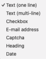 A - field types
 -
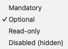 B - field status
 -
 C - field layout


Layout
Layout lets you set the formatting as it will appear on the web page.

Form Style: Choose the alignment of the input field labels: on the same line or with the label above the input field
Field theme: Select a predefined style from the table; see (A)
Grid spacing: Select the desired distance between the label and an input field
Visual layout editor: Specify the grid in which the fields are displayed; see (B)
Submit button text: Enter the text to be displayed on the submit button
Submit button alignment: Specify the alignment for the text on the submit button
A - Field Theme

Each theme has its own settings, or none: No styling
Try them out, and choose the theme that best suits your website.
See (C) for examples by theme.
B - Visual Layout Editor
You can arrange the fields in 1, 2, or 3 columns. See the example.
You can also spread the fields across multiple rows.
Move the columns by dragging them or using the position selection buttons.
You can set the rows using the position selection buttons.
C - examples of field themes
Theme: No StylingLayout no styling
Theme: Nice form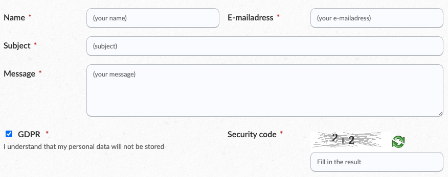

Theme: Bootstrap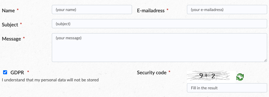

Theme: Material UI (filled)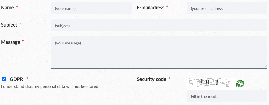

Theme: “Material UI (outlined)”

Theme: “Material UI (standard)”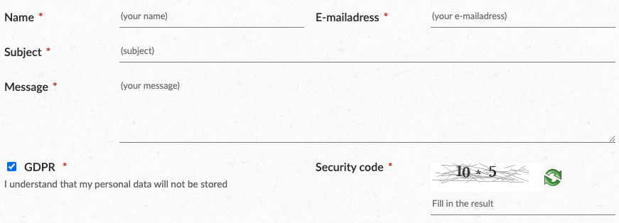

Berichten
Met Berichten stel je opmaak vast zoals die op de webpagina wordt getoond.

E-mailconfiguratie: de module controleert de e-mailconfiguratie. Deze stel je in WB in, menu Instellingen, onderdeel Mailerinstellingen.
E-mailtemplates: stel je eigen templates samen, als automatisch antwoord naar een inzender en of naar de e-mailafhandelaar. Zie (A), onder (B) vind je een voorbeeld
Formulierinzendingen: indien je deze laat opslaan kan je ze bekijken. Denk er aan dat gegevens vastleggen onder de AVG valt. Zie (C)
A - e-mailtemplates

Naam: bedenk een korte, duidelijke naam
Aan: inzender > gebruik de placeholder, bv [e-mailadres], afhandelaar > type het mailadres in
Van (e-mailadres): type een e-mailadres in
Van naam: type een e-mailadres in
Reply-to veld: type een e-mailadres in, of laat leeg
Onderwerp: type een onderwerptekst in
E-mailtekst: gebruik de editor om je eigen opmaak te creëren, gebruik [veldnaam] om de gegevens op te halen uit de datavelden
B - voorbeeld e-mailtemplate

C - formulierinzendingen
Het opslaan van persoonlijke gegevens valt onder de AVG. Het is aanraden om op het formulierveld dit aan te geven zodat de potentiele inzender dit vooraf weet. Advies: niets opslaan levert geen risico's op voor jou.
Klik op een ontvangen reactie om de details in te zien:

Succes
Met Succes stel je een succespagina of een succesbericht in
-
Pagina: kies de gewenste pagina (die je zelf hebt aangemaakt)
-
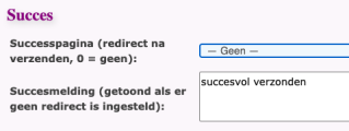 Bericht: kies bij Pagina -- Geen -- en vul een tekst in


