
FR Forms/en: verschil tussen versies
Nieuwe pagina aangemaakt met 'FR Forms' |
Geen bewerkingssamenvatting |
||
| (5 tussenliggende versies door 3 gebruikers niet weergegeven) | |||
| Regel 1: | Regel 1: | ||
<languages /> | <languages /> | ||
FR Forms is a module that allows you to create various (contact) forms. | |||
FR Forms is | |||
Each form has its own settings: | |||
* Fields: Create various types of data fields as needed | |||
* | * Layout: For the “front end” of your website | ||
* | * Messages: Create automatically generated notifications and emails as needed | ||
* | * Success: Choose between a custom page or a simple notification (text) | ||
* | |||
As an additional option, you can use CAPTCHA to protect against spam. | |||
== Fields == | |||
[[File:Fields.png|left|117x117px|Fields]] | |||
[[File: | Click the ''Add Field'' button to add new fields | ||
<br clear="all"> | <br clear="all"> | ||
Depending on the field type, several properties are displayed: | |||
[[File:Fields-add.png|left|397x397px|Add fields]] | |||
[[File: | '''Type:''' Select the desired type; see (A) | ||
'''Type:''' | |||
'''Label:''' Enter a label for this field | |||
'''Label:''' | |||
'''Placeholder key:''' This is automatically filled in when a new field is created | |||
'''Placeholder | |||
'''Status:''' Is the field mandatory, optional, or something else? See (B) | |||
'''Status:''' | |||
'''Default value:''' optional | |||
''' | |||
'''Placeholder text:''' optional, to help visitors enter information | |||
''' | |||
'''Help text:''' optional; displays a help message for visitors | |||
''' | |||
'''Maximum length:''' optional; use this to limit input | |||
''' | |||
'''Layout selection button:''' optional; set the page view; see (C) | |||
''' | |||
<br clear="all"> | <br clear="all"> | ||
=== Example of a created field === | |||
[[File:Fields-example.png|left|345x345px|example]] | |||
[[File: | |||
<br clear="all"> | <br clear="all"> | ||
=== Order - as displayed on the web page === | |||
[[File:Fields-order.png|alt=field order]] | |||
[[File: | |||
<br clear="all"> | <br clear="all"> | ||
The web page displays the created fields in the order they appear in the page section. You can change this order using the '''up''' and '''down''' buttons. | |||
<gallery widths=250> | <gallery widths=250> | ||
File: | File:Fields-type.png|alt=veldtypen|149x149px|'''A - field types''' | ||
File: | File:Fields-status.png|alt=veldstatussen|168x168px|'''B - field status''' | ||
File: | File:Fields-layout.png|alt=veld pagina weergave|353x160px|'''C - field layout''' | ||
</gallery> | </gallery> | ||
== Layout == | |||
''Layout'' lets you set the formatting as it will appear on the web page. | |||
[[File:Layout.png|left|421x421px|layout]] | |||
[[File: | '''Form Style:''' Choose the alignment of the input field labels: on the same line or with the label above the input field | ||
''' | |||
''' Field theme:''' Select a predefined style from the table; see (A) | |||
''' | |||
'''Grid spacing:''' Select the desired distance between the label and an input field | |||
'''Grid | |||
'''Visual layout editor:''' Specify the grid in which the fields are displayed; see (B) | |||
''' | |||
'''Submit button text:''' Enter the text to be displayed on the submit button | |||
''' | |||
''' Submit button alignment:''' Specify the alignment for the text on the submit button | |||
''' | |||
<br clear="all"> | <br clear="all"> | ||
=== '''A - Field Theme''' === | |||
=== '''A - | [[File:Layout-theme.png|left|Layout theme]] | ||
[[File: | Each theme has its own settings, or none: '''No styling''' | ||
Try them out, and choose the theme that best suits your website. | |||
See (C) for examples by theme. | |||
<br clear="all"> | <br clear="all"> | ||
=== '''B - Visual Layout Editor''' === | |||
=== '''B - | [[File:Layout-editor.png|left|492x492px|Visual Layout Editor]] | ||
[[File: | You can arrange the fields in 1, 2, or 3 columns. See the example. | ||
You can also spread the fields across multiple rows. | |||
Move the columns by dragging them or using the position selection buttons. | |||
You can set the rows using the position selection buttons. | |||
<br clear="all"> | <br clear="all"> | ||
< | <span id="C_-_voorbeelden_veldthema's"></span> | ||
=== '''C - | === '''C - examples of field themes''' === | ||
< | <span id="thema:_Geen_stylingalt=geen_stijling"></span> | ||
===== | ===== Theme: ''No Styling''[[File:Layout-nostyling.png|alt=Layout no styling]] ===== | ||
< | <span id="thema:_Nice_formalt=nice_form"></span> | ||
==== | ==== Theme: ''Nice form''[[File:layout-niceform.png|alt= Layout nice form]] ==== | ||
< | <span id="thema:_Bootstrapalt=bootstrap"></span> | ||
==== | ==== Theme: ''Bootstrap''[[File:Layout-bootstrap.png|alt=Layout bootstrap]] ==== | ||
< | <span id="thema:_Material_UI_(filled)alt=material_UI_filled"></span> | ||
==== | ==== Theme: ''Material UI (filled)''[[File:Layout-uifilled.png|alt=Layout material UI filled]] ==== | ||
< | <span id="thema:_Material_UI_(outlined)alt=material_UI_outlined"></span> | ||
==== | ==== Theme: “Material UI (outlined)”[[File:Layout-uioutlined.png|alt=Layout material UI outlined]] ==== | ||
< | <span id="thema:_Material_UI_(standard)alt=material_UI_standard"></span> | ||
==== | ==== Theme: “Material UI (standard)”[[File:Layout-uistandard.png|alt=Layout material UI standard]] ==== | ||
</ | |||
== Messaging == | |||
“Messaging” lets you set the formatting as it appears on the web page. | |||
[[File:Messaging.png|left|417x417px]] | |||
'''Email configuration:''' The module checks the email configuration. You can set this up in WB under the Settings menu, in the Mailer Settings section. | |||
'''Email Templates:''' Create your own templates to use as automatic replies to a submitter and/or to the email handler. See (A); under (B) you'll find an example | |||
'''Form submissions:''' If you save them, you can view them. Keep in mind that data collection is subject to the GDPR. See (C) | |||
<br clear="all"> | |||
=== A - Email Templates === | |||
[[File:Messaging-reply.png|left|391x391px|Message reply]] | |||
'''Name:''' Choose a short, clear name | |||
'''To:''' sender > use the placeholder, e.g., [email address], recipient > type in the email address | |||
'''From (email address):''' Enter an email address | |||
'''Name:''' Enter the sender's name or title | |||
'''Reply-to field:''' Enter an email address, or leave it blank | |||
'''Subject:''' Type a subject line | |||
'''Email text:''' Use the editor to create your own formatting; use [field name] to retrieve data from the data fields | |||
<br clear="all"> | |||
=== '''B - Sample Email Template''' === | |||
[[File:Messaging-example.png|alt=Messaging example|503x503px]] | |||
<br clear="all"> | |||
<span id="C_-_formulierinzendingen"></span> | |||
=== '''C - Form Submissions''' === | |||
The storage of personal data is subject to the GDPR. It is recommended that you indicate this in the form field so that potential submitters are aware of it in advance. Tip: Not storing any data poses no risk to you. | |||
Click on a received comment to view the details: | |||
[[File:Messaging-responses.png|alt=Messaging responses|497x497px]] | |||
== Success == | |||
Use ''Success'' to set up a success page or a success message | |||
<gallery widths=400> | |||
File:File:Success-page.png|alt=Success page|398x398px|'''Page:''' Select the desired page (that you created yourself) | |||
File:Success-text.png|alt=Success message|398x398px|'''Message:''' select ''Page -- None --'' and enter some text | |||
</gallery> | |||
Huidige versie van 16 jul 2026 20:28
FR Forms is a module that allows you to create various (contact) forms.
Each form has its own settings:
- Fields: Create various types of data fields as needed
- Layout: For the “front end” of your website
- Messages: Create automatically generated notifications and emails as needed
- Success: Choose between a custom page or a simple notification (text)
As an additional option, you can use CAPTCHA to protect against spam.
Fields

Click the Add Field button to add new fields
Depending on the field type, several properties are displayed:

Type: Select the desired type; see (A)
Label: Enter a label for this field
Placeholder key: This is automatically filled in when a new field is created
Status: Is the field mandatory, optional, or something else? See (B)
Default value: optional
Placeholder text: optional, to help visitors enter information
Help text: optional; displays a help message for visitors
Maximum length: optional; use this to limit input
Layout selection button: optional; set the page view; see (C)
Example of a created field

Order - as displayed on the web page

The web page displays the created fields in the order they appear in the page section. You can change this order using the up and down buttons.
-
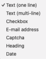 A - field types
 -
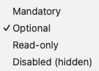 B - field status
 -
 C - field layout


Layout
Layout lets you set the formatting as it will appear on the web page.

Form Style: Choose the alignment of the input field labels: on the same line or with the label above the input field
Field theme: Select a predefined style from the table; see (A)
Grid spacing: Select the desired distance between the label and an input field
Visual layout editor: Specify the grid in which the fields are displayed; see (B)
Submit button text: Enter the text to be displayed on the submit button
Submit button alignment: Specify the alignment for the text on the submit button
A - Field Theme

Each theme has its own settings, or none: No styling
Try them out, and choose the theme that best suits your website.
See (C) for examples by theme.
B - Visual Layout Editor

You can arrange the fields in 1, 2, or 3 columns. See the example.
You can also spread the fields across multiple rows.
Move the columns by dragging them or using the position selection buttons.
You can set the rows using the position selection buttons.
C - examples of field themes
Theme: No StylingLayout no styling
Theme: Nice form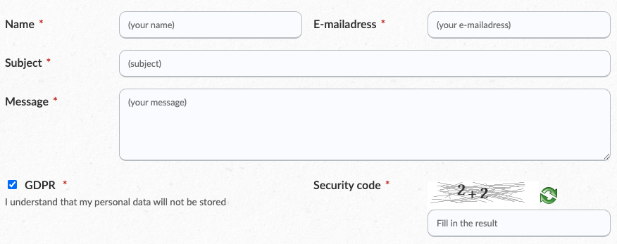

Theme: Bootstrap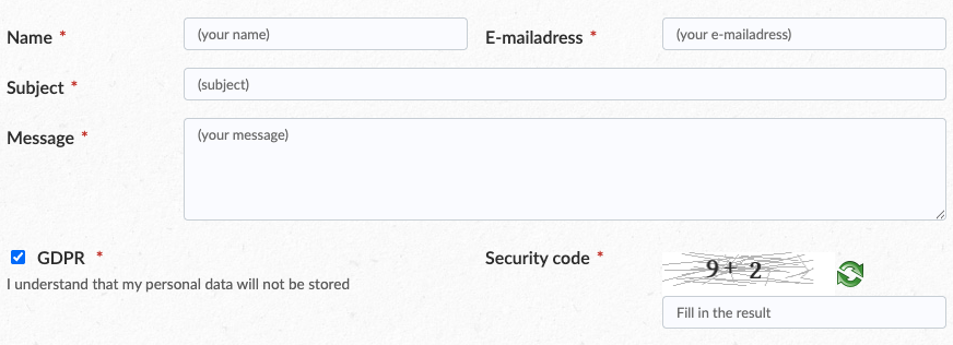

Theme: Material UI (filled)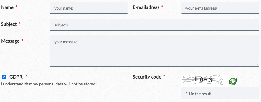

Theme: “Material UI (outlined)”

Theme: “Material UI (standard)”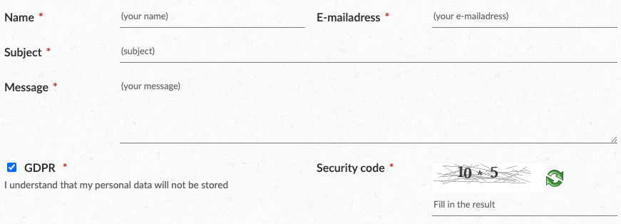

Messaging
“Messaging” lets you set the formatting as it appears on the web page.

Email configuration: The module checks the email configuration. You can set this up in WB under the Settings menu, in the Mailer Settings section.
Email Templates: Create your own templates to use as automatic replies to a submitter and/or to the email handler. See (A); under (B) you'll find an example
Form submissions: If you save them, you can view them. Keep in mind that data collection is subject to the GDPR. See (C)
A - Email Templates

Name: Choose a short, clear name
To: sender > use the placeholder, e.g., [email address], recipient > type in the email address
From (email address): Enter an email address
Name: Enter the sender's name or title
Reply-to field: Enter an email address, or leave it blank
Subject: Type a subject line
Email text: Use the editor to create your own formatting; use [field name] to retrieve data from the data fields
B - Sample Email Template

C - Form Submissions
The storage of personal data is subject to the GDPR. It is recommended that you indicate this in the form field so that potential submitters are aware of it in advance. Tip: Not storing any data poses no risk to you.
Click on a received comment to view the details:

Success
Use Success to set up a success page or a success message
-
Page: Select the desired page (that you created yourself)
-
 Message: select Page -- None -- and enter some text


